How to Visualize a CNN Filter
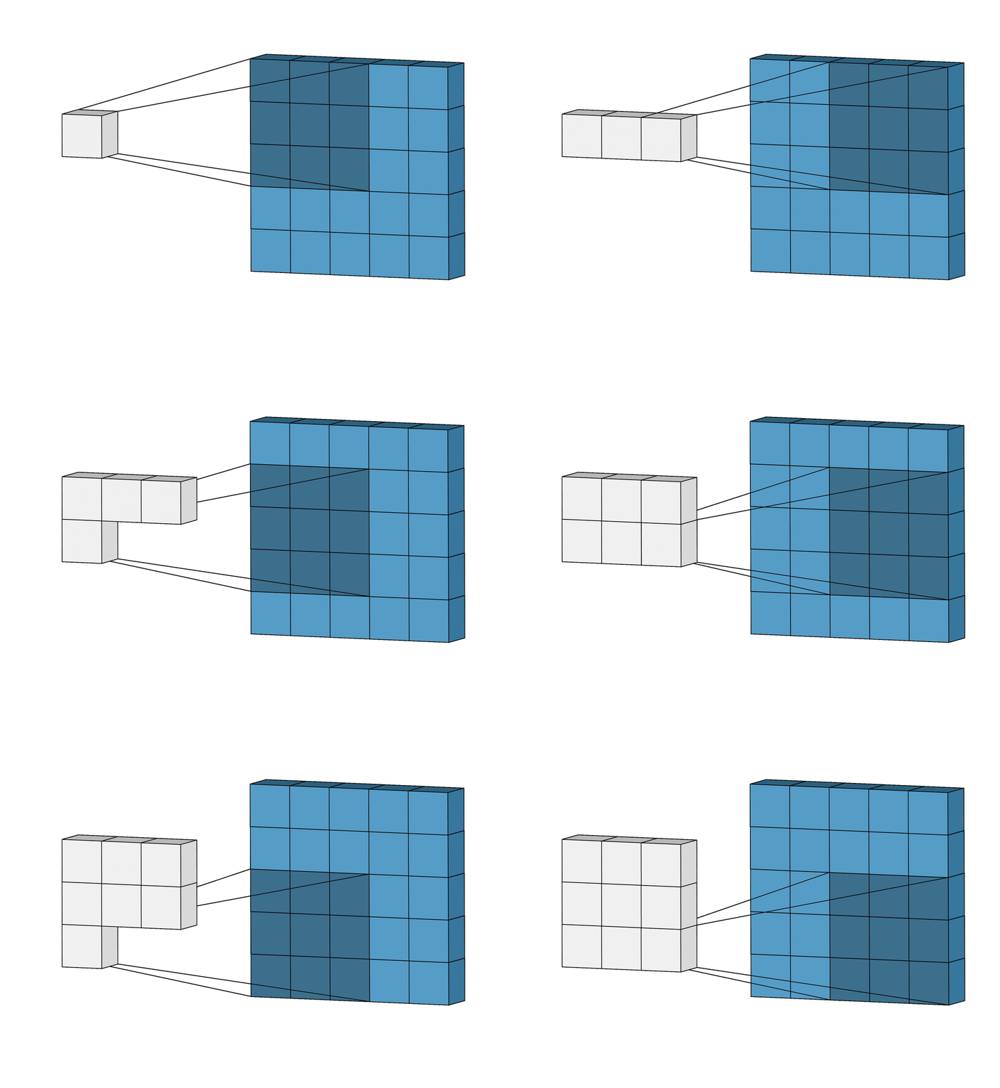
In this blog, you will understand how to visualize a single CNN layer filter.
Before starting let us first understand what CNN is, A Convolution Neural Network (CNN) is a Deep Learning algorithm that takes an image as input and assigns weights and biases to various objects in the image to be able to differentiate from one other.
Let us understand how CNN works
Input Image:
The Image is basically a representation of pixels and a pixel is a combination of RGB values. So we treat this as a three-channel array.
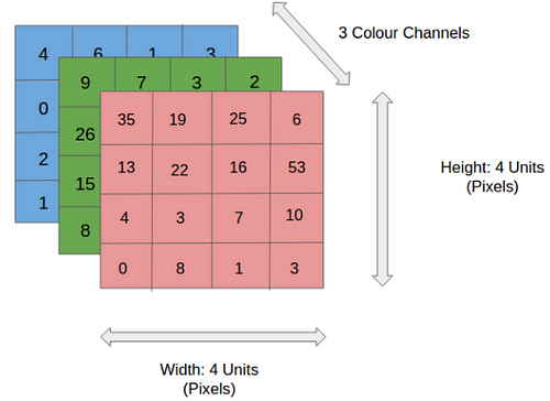 The image is represented as a three-dimension array and each dimension stores R/G/B values respectively and the size of the array is equal to the size of the image.
Kernal:
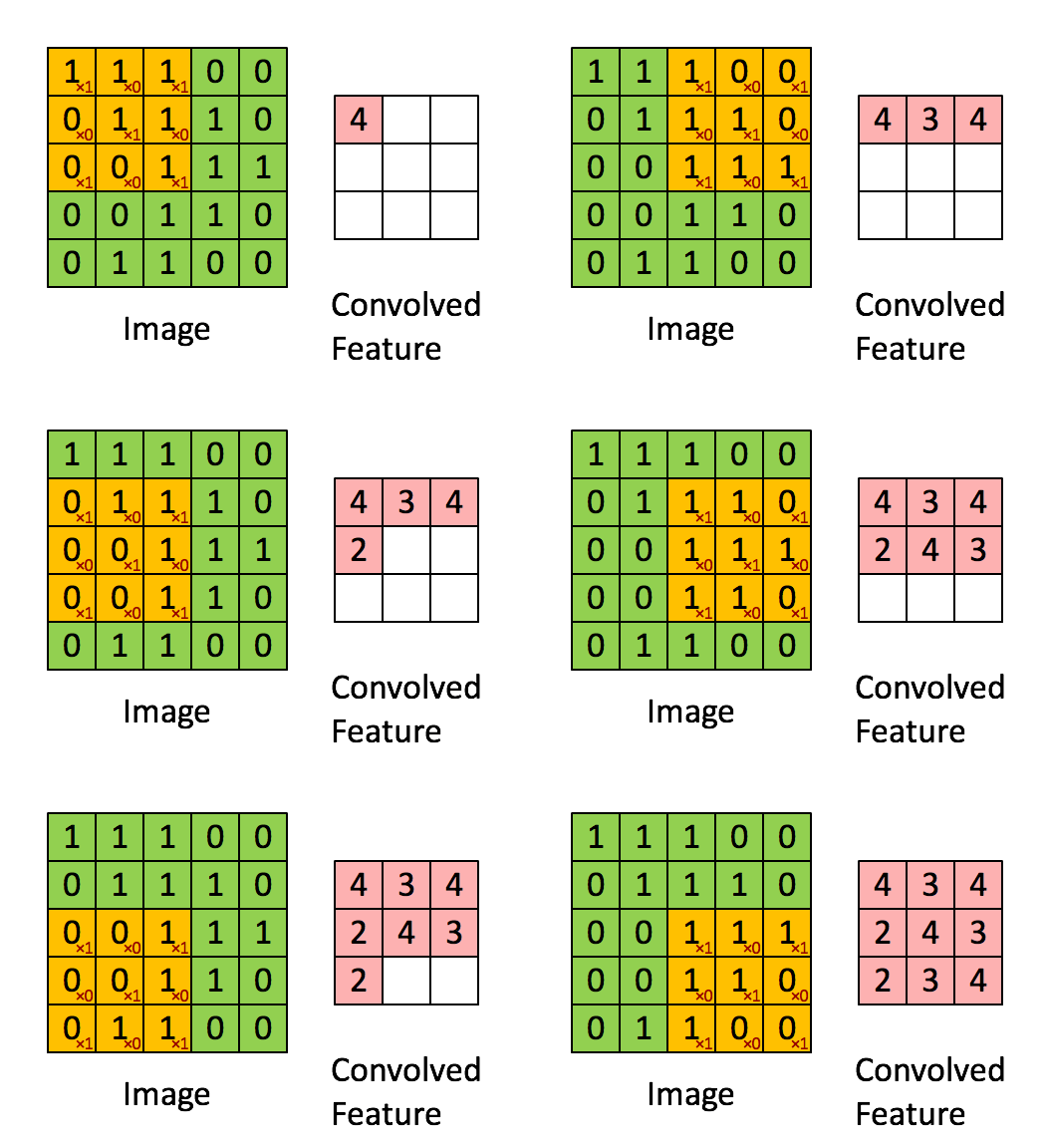
Kernal (also known as a filter) is a matrix that is the first operation carried out in CNN and it helps in getting Convolved Feature.
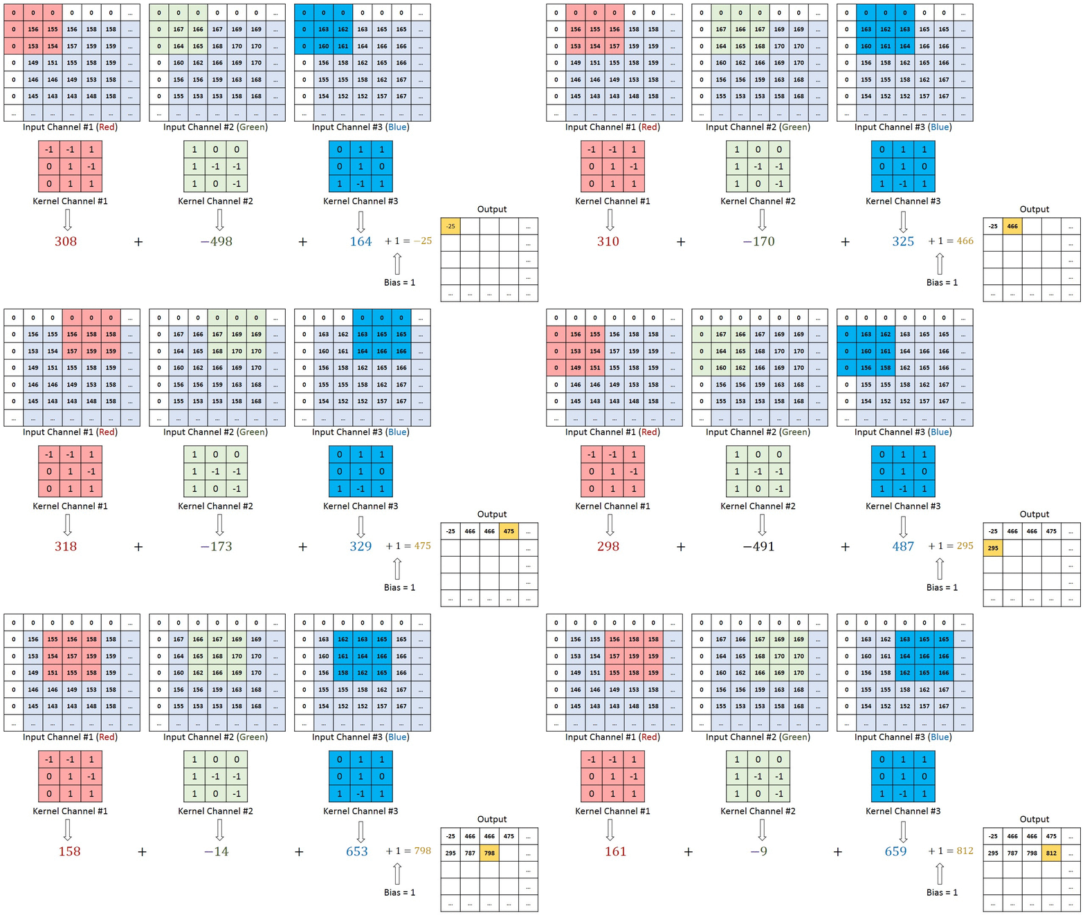
 The below image shows how the filters are applied to the entire image and all channels
Pooling Layer:
The Pooling Layer is responsible to reduce the size of Convolved Features. The size is reduced to decrease the computational power which is required to process the data.
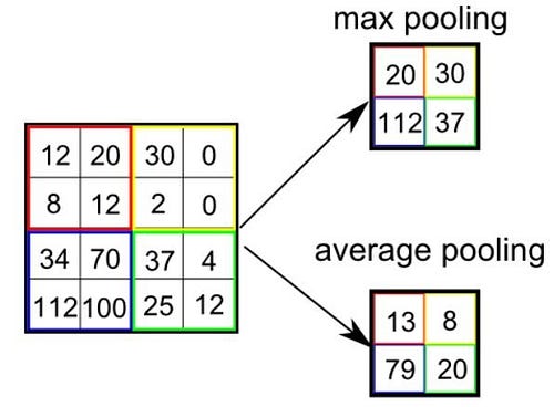 In max-pooling, you consider the maximum value in the matrix, and in average pooling, you consider the average of the matrix
Now Let us Visualize a CNN layer Filter
First, we need to import all the required library
import numpy as np
import pandas as pd
import tensorflow as tf
from tensorflow import keras
import matplotlib.pyplot as plt
from tensorflow.keras.layers import Conv2D, MaxPooling2D
from tensorflow.keras.models import Sequential
from tensorflow.keras.layers import Dense, Flatten
Let us Load the MNIST Dataset from Keras
The MNIST dataset is basically a dataset containing handwritten digits

mnist = tf.keras.datasets.mnist
From the dataset, now we'll split the data into a training set and testing set
(X_train,y_train),(X_test,y_test) = mnist.load_data()
Check the shape of training data and testing data
X_train.shape, y_train.shape, X_test.shape, y_test.shape
First, take a sample data and visualize it to verify
plt.imshow(X_train[0])
Create a Simple CNN Layer with 10 filters and 3x3 Kernel
model = Sequential()
model.add(Conv2D(10,(3,3),input_shape=(28,28,1),activation='relu'))
Grab a single data to get weights and visualize the weigths
data = X_train[0]

# reshape the data to 1,28,28,1
data = data.reshape(1,28,28,1)
Get the weights
yhat = model.predict(data)
Check the Shape of yhat / prediction
yhat.shape
Reshape the yhat so that we can visualize it.
yhat = yhat.reshape(26,26,10)
Visualize the Filters
for i in range(10):
    plt.imshow(yhat[:,:,i])
    plt.show()
Hope you understood what CNN is and how to visualize a single layer in CNN.

